 PH
PHMobile Simulator - Responsive Testing Tool
4.9 out of 5 ★★★★★
3.8k ratingsOverview
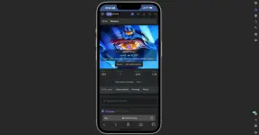
Smartphone and tablet simulator on computer with several models to test mobile responsive websites.Check the rendering on multiple devices, create impactful client demos, and save time in your testing.
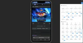
58 devices available (with new ones added regularly)
 45 smartphones (old and recent)
 5 tablet models
 ️ 11 special devices (smartwatches, kiosks, computers…)
Main features
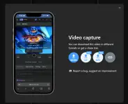
 One-click video capture (WEBM, GIF, MP4) for your demos and tutorials
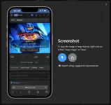
 Transparent PNG screenshots, perfect for emails or presentations
 Dark mode for enhanced visual comfort
Also included
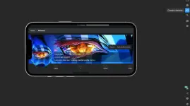
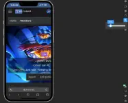
 Free downloadable transparent device mockups Option to switch to landscape mode Zoom just like on a real mobile More than 10 customization options (PWA mode, fullscreen, native keyboard, etc.)
Mobile FIRST has been the most powerful and reliable simulation extension for over 5 years.
Our rating on the Chrome Store speaks for itself.
 It integrates many technical tricks to reproduce the mobile experience as closely as possible.
Of course, this does not replace testing on a real device at the end of your development for full validation.
 FREE VERSION

Spoiler contents are visible only to Established Members.