While the design has a distinct air of luxury, Masqualero’s chiseled letterforms aren’t afraid to bite: They’re confident, proud, and dauntless. Ready to take up the mantle of whatever typographic challenge is placed before them. Premium share.
A combination of two typefaces, namely, half Antiqua and half Egyptienne, Franziska combines good legibility in running texts with interesting characteristics in large dot sizes. It covers its dynamic renaissance substructure with static, classical clothes, speaks all Latin languages and shows a completely new look with its italics. Premium share!
Breve is unquestionably a superfamily. There are a lot of Breves: Title, Text, Sans Title, Sans Text, Slab Title, Slab Text, News, and Display. Now, mix two or more and you’ll get more than enough styles for any editorial needs. Outrageously expensive collection, too – a jaw-dropping total price of $3,020!
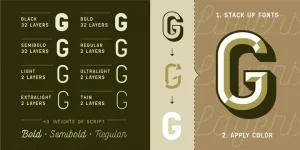
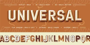
Created in 2020, Chamelton is a massive, one-of-a-kind vintage layered font family of 113 styles! It gives you the freedom of using a combination of layers, colors, and font weights: effects that include but not limited to display, emboss, 3D, flat shadow, drop shadow, script, and extras. Try it now.
Quadon was designed to fill the gap between traditional serifs and the lasting trend of using sans serif fonts for contemporary design. The result is a modern, clear and infinitely flexible interpretation of slab serif fonts.
Copied from the author: The Novera family is a sharp geometric sans in ten weights plus matching italics, available in two versions – Modern and Classic. It has a contemporary, approachable and multifunctional yet characteristic design, which comes with an extensive glyphs set of 1000+ glyphs per font, meeting all typographic demands.
Somewhat uncommon in use but one of the most beautiful typefaces ever created, Mrs Eaves is a transitional serif typeface designed by Zuzana Licko in 1996. It is a variant of Baskerville, which was designed in Birmingham, England, in the 1750s. Mrs Eaves adapts Baskerville for use in display contexts, such as headings and book blurbs, through the use of a low x-height and a range of unusual combined characters or ligatures. Also, it comes included with XL font styles to address the issue of long readerly texts, particularly in environments such as the interiors of books, magazines, and newspapers.
For specifications and guide on how to use, download the You do not have permission to view the full content of this post.Log in or register now.
Introduced with a half price offer, Harmonique is a 32-font type family in contrasting text and display styles that is perfect for branding projects (headlines, titles, and identity designs). It comes with built-in discretionary ligatures to enhance your titles and headlines. At this time of writing, it’s currently placed at top 6 on MyFont’s list of hot new fonts!
Introducing Quorthon – a blackletter family of 3 styles namely Black, Dark, and Grey, with 5 weights each. It brings the dramatic-looking hand lettering from the Middle Ages a contemporary feel that’s more suited to today’s visual designs. Each style is designed distinctly to meet your Gothic calligraphy needs.
The Diamonds type family was designed by Hannes von Döhren in 2012. It is an experimental search for geometric new letterforms, which are still easy to read and generate some unexpected attention. Hannes wanted to create a straight and clear typeface but pull away from the path of classic and well-learned letter shapes.
“Keep calm and ‘HODL’.” Hold on to crypto for dear life! The famous font used in motivational posters, or otherwise known as memes, has been updated to version 2.0 (2017). It brings a comprehensive update that consists of numerous refinements and improvements across all styles. The family now supports extended Latin characters covering around 85+ languages. Also, the four italics have been optically corrected with revised, true italic forms of “a” and “f.”
Another beautiful typeface designed by René Bieder, Faktum is an exploration into the geometric sans genre, inspired by mid-century modern architecture and interior design. It is a family of 40 fonts that include four widths of your choosing (extra condensed, condensed, normal, and wide), with matching italics to beat.
Designed by the talented duo based in Indonesia, Gilang Purnama and Ilham Herry, Sickles takes you back to the V I C T O R I A N era of lettering and signages. Perfect for logos, visual brandings, posters, beer labels, packaging, classic bar decor, vintage hotels, and many more.
Voyage is a friendly vintage script typeface. Graphic designer Emil Karl Bertell created this smooth script in 2013 and is published by Fenotype. The typeface consists of two weights and ornaments. Furthermore, the Voyage family comes with several alternates and OpenType features. You can easily activate any feature by clicking on swash, contextual, stylistic or titling alternates or discretionary ligatures in your OpenType-savvy program, or manually select the features and alternate characters from the glyph palette of your word-processing app. This script font family is a great choice for fancy headlines in invitations or posters for celebrations and events.
Are you fond of using comic fonts? Ready for Anything suits any comic book art style you can throw at it, hence the name. Designed with a Speedball C-6 pen nib, the comic font features contextual alternates that swap through six versions of every letter, three versions of every number, exclamation point, and question marks. Also – assuming you use an OpenType-conscious program – it automatically corrects and creates a bouncy baseline for any more than three consecutive letters, like in the images below.
If that wasn’t enough, here’s Might Makes Right to complement the super-versatile Ready For Anything. When you look at it up-close, you can tell the distinctive difference between the two.
NB: The files are purchased straight from the official source. Please do not attempt to distribute them outside of PHCorner and use commercially. Only for personal purposes. Thanks.